Meesho is an e-commerce brand with a vision to democratize internet commerce for everyone. It empowers sellers by offering them a framework to establish and manage their online shops, enabling them to list products and maximize sales at competitive prices.
Since joining the design team in 2022, I've been instrumental in optimizing the seller panel experience, contributing to our rapid growth from 8Lakh to 18Lakh+ active sellers within 2 years.
INTRODUCING PRICING PANEL
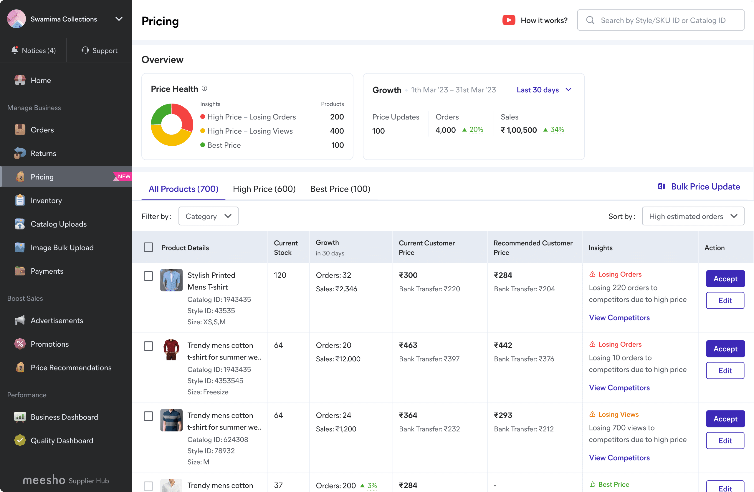
An innovative platform designed to assist sellers in optimizing product pricing and driving maximum order growth. In 2023, we underwent a significant overhaul of the pricing panel, redefining its logic and enhancing usability through targeted nudges and enhanced functionality."
MY ROLE
Product Design, Research, Analysis, Visuals, Prototyping, Usability Testing
STATUS
Pricing panel was rolled out to 13 Lakh+ sellers on Aug’23
STAKEHOLDER COLLABORATION
Product Manager, Business, Developers, Key Account Managers
HOW IT STARTED
Listen or Die - is what we live by at Meesho. While starting my journey at meesho, I interacted with 20+ sellers over call to understand their experience of “Seller Panel/Price Recommendation”. Becoming Rockstar Rookie was first step towards solving from user-first mindset.
RESEARCH INSIGHTS
1
Need for a dedicated Pricing panel
Supplier wants visibility of all products in a single real-estate to be able to efficiently take price edit actions
2
Highlight critical recommendations
Sellers need education in accepting the high confidence recommendations that leads to maximum growth
3
Product vs catalog view of listings
There is no bulk action today. Seller needs to select catalog then products - Bulk action is critical for large
OLD DESIGNS
BRAINSTORMING WITH STAKEHOLDER
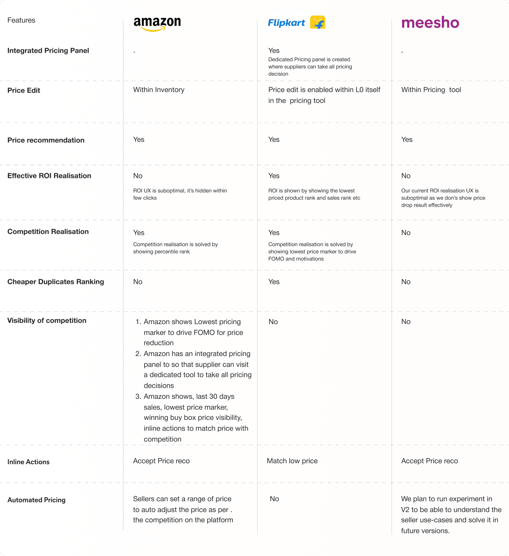
We kicked off the process with comprehensive experience review of the existing designs and competitive benchmarking session to figure out the gaps.
PROBLEM STATEMENT
Based on the learnings from seller LoDs and internal session, we figured out the below challenges and defined the scope of problem to be solved.
Lack of feedback loop and poor incentive alignment
On average, around 60% of price decrease action do not lead to order growth leading to trust issues
Suboptimal UX, price acceptance required 4 steps
~70% of recommendations are for Large scale sellers (having >5k products) who need bulk accepts
Competition realization and ineffective nudges
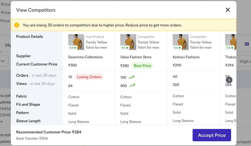
Usage of compare price was <20% and sellers where not convinced on why they should reduce price
DESIGN GOALS
This further helped us setting clear design goals and focus areas. We worked on versioning the solve to optimise on the release.
1) MEETING USER NEEDS
"Help seller update their price with minimal efforts and if needed in bulk as well"
2) USER PERCEPTION
"Changing the seller perception on price reduction and highlighting how their action leads to better results"
3) TRANSPARENCY
"Helping seller with competition realisation and how they can form an informed decision on price change"
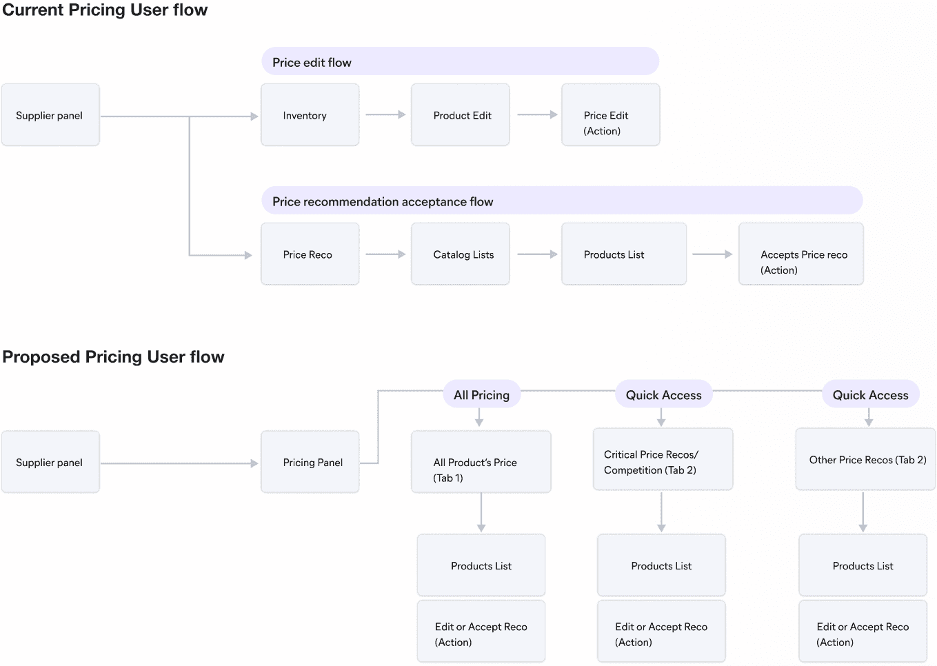
PROPOSED USER FLOW
DESIGN EXPLORATIONS
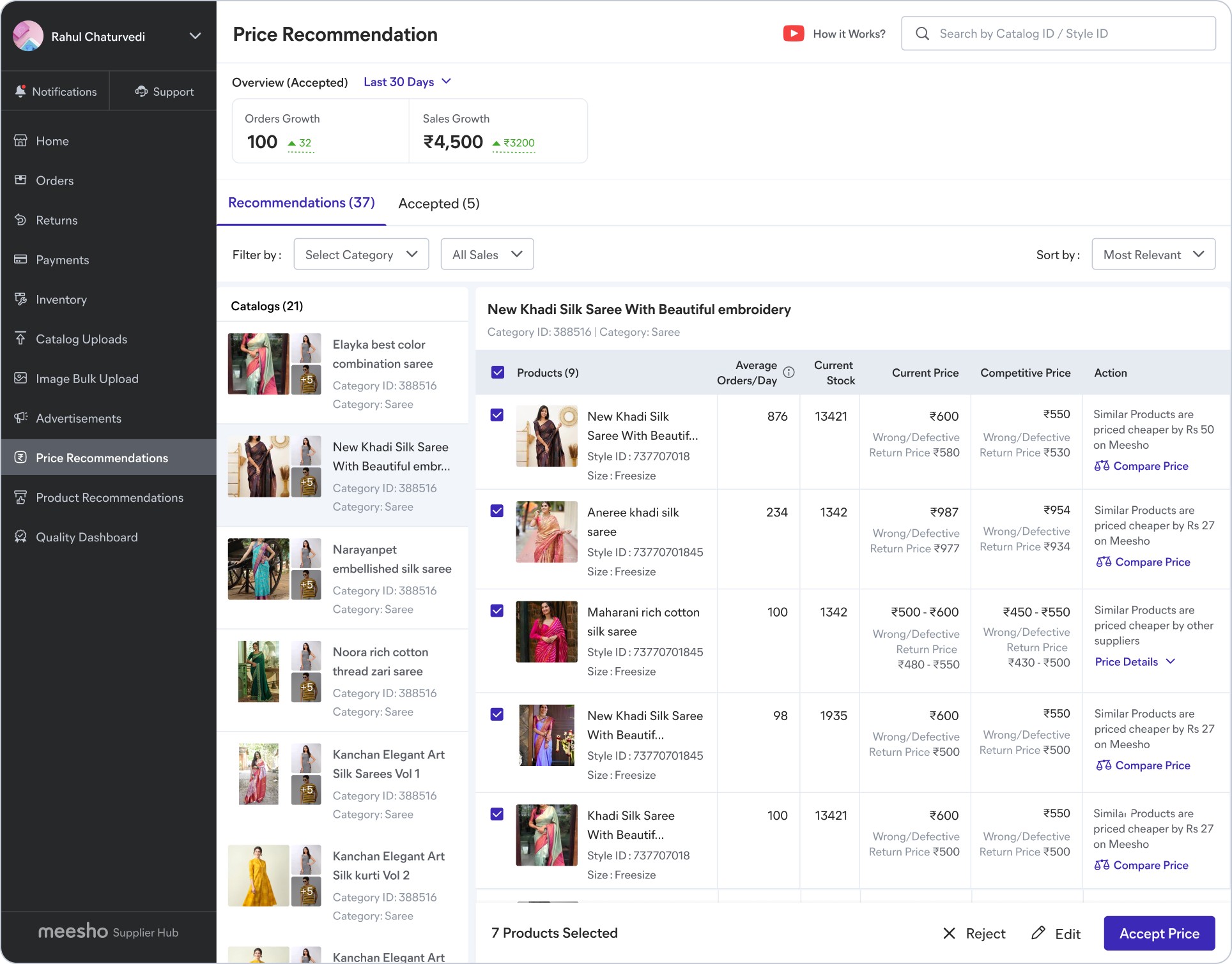
While exploring the solve major focus was on how to optimise the decision making for sellers, since sellers had multiple product (5k+ in case of large scale seller). We also wanted to provide an overview without hampering the main action of accepting recommendations.
We iterated and explored in lines of segregating products at a Tab level or within column itself as tab click rate also reduces due to no. of tabs increase.
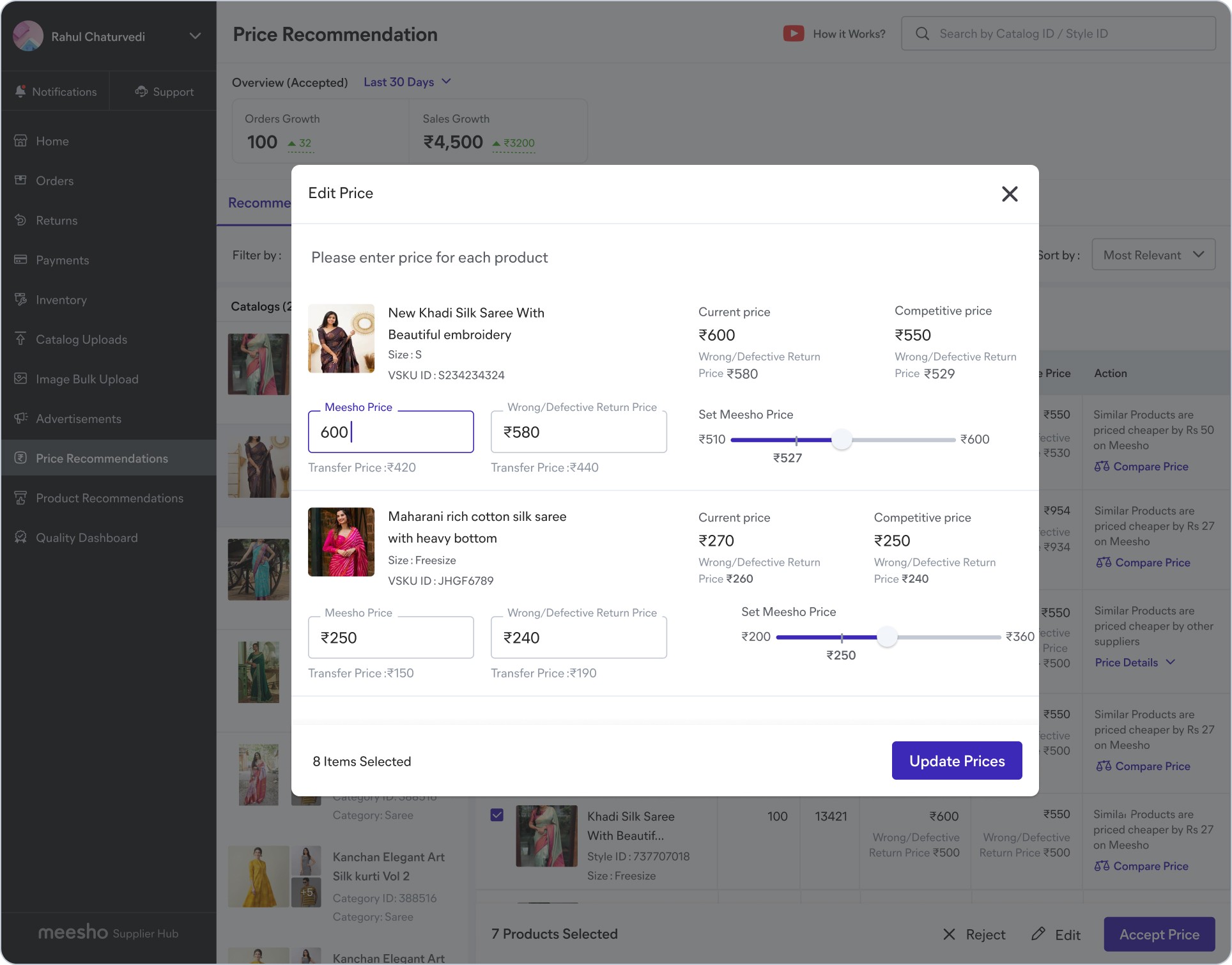
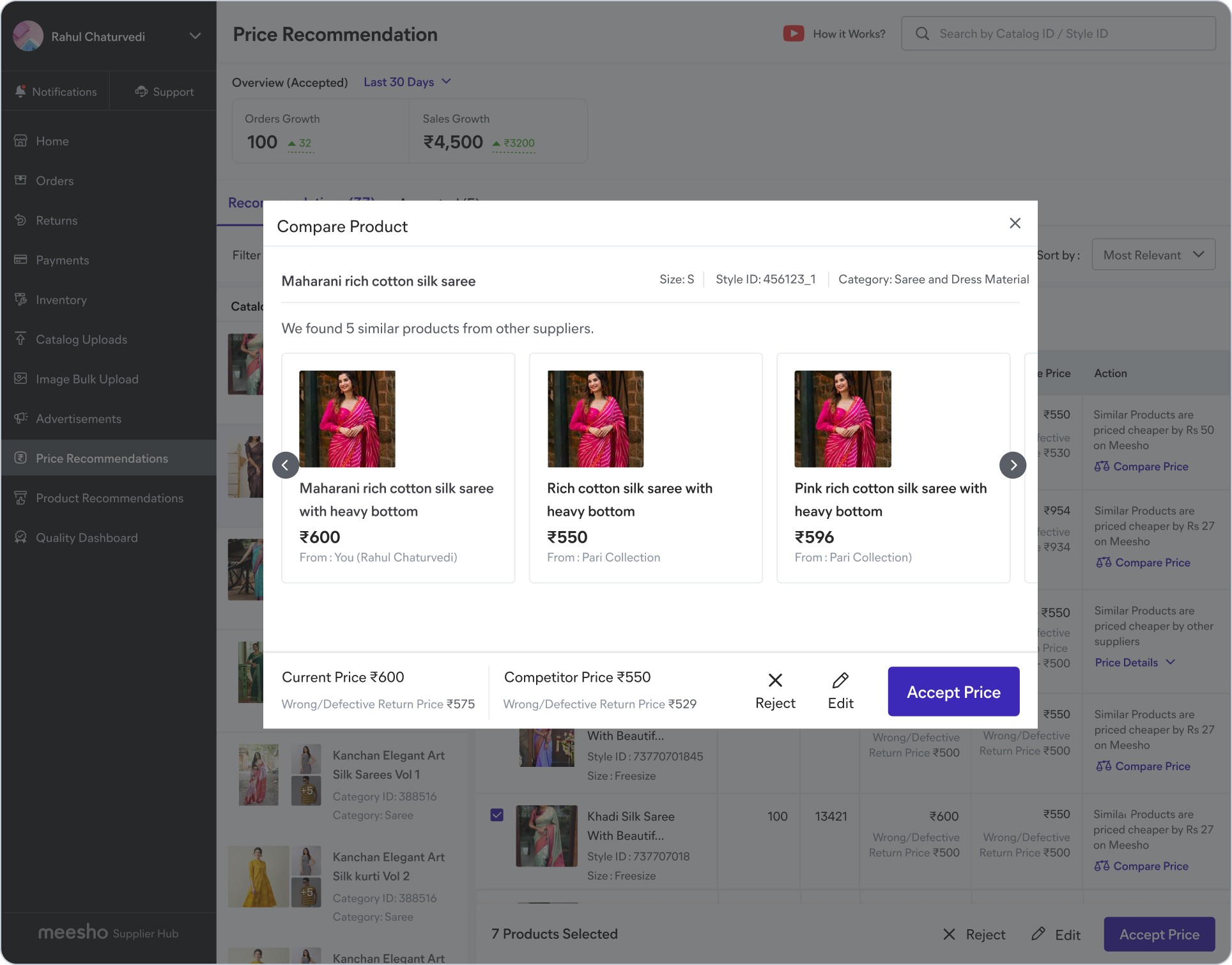
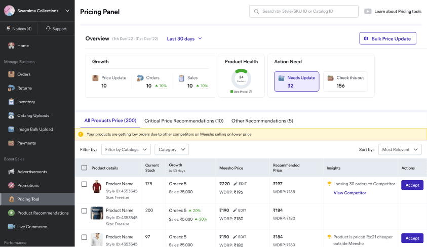
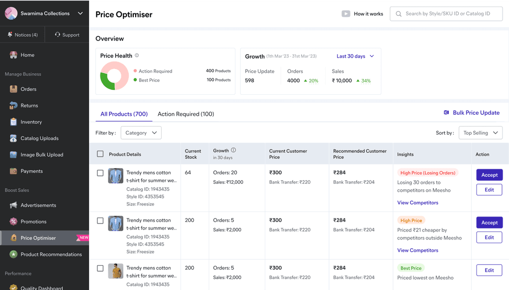
Below are final low-fi iterations of Landing page. We worked on end-to-end flows of Acceptance | Editing Price | Competitor Check and feedback realisation.
EXPLORATION 1
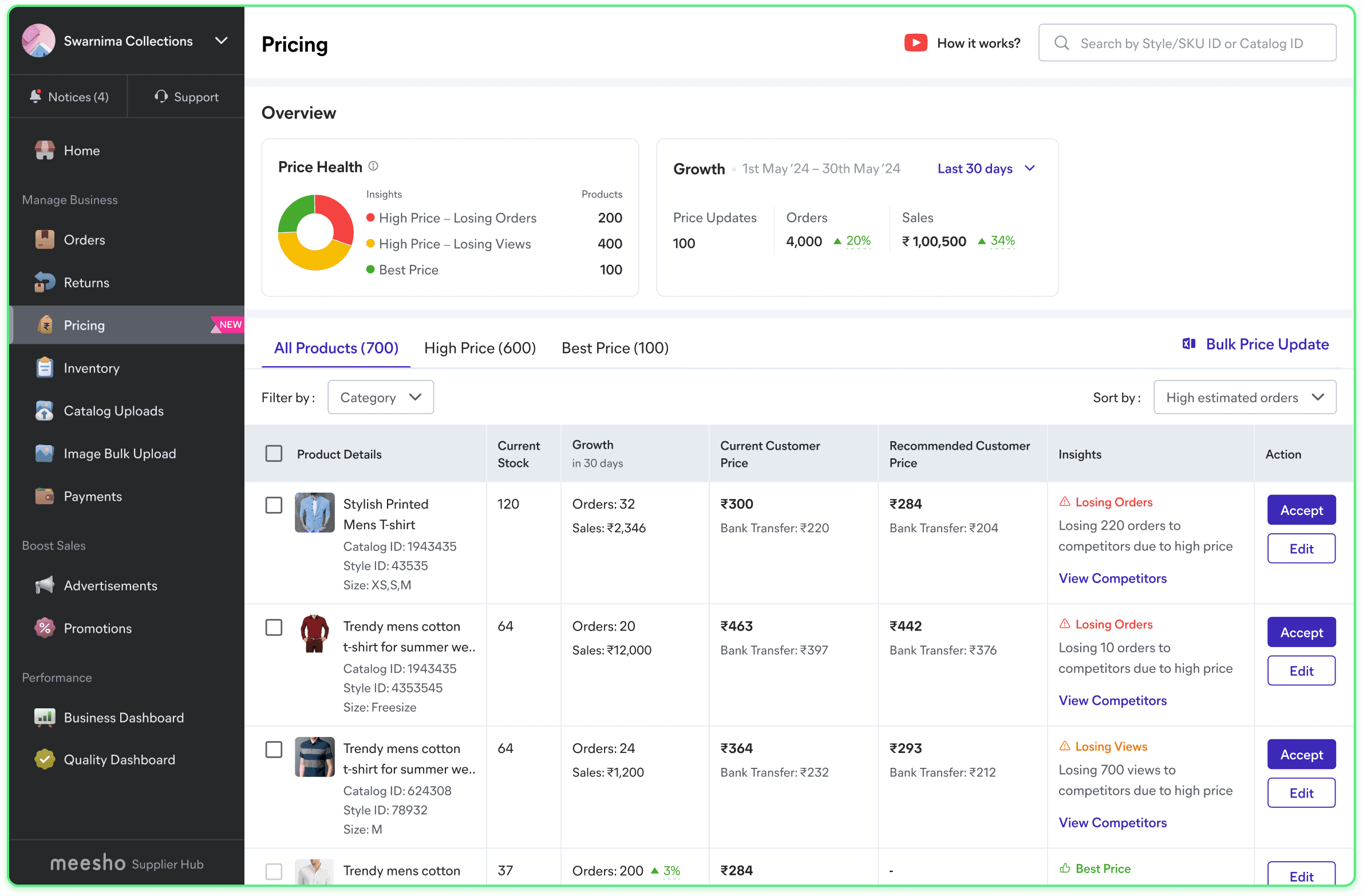
Moved from catalog to product level view for inline actions.
Improved overview section with product health and nudge to take action
.
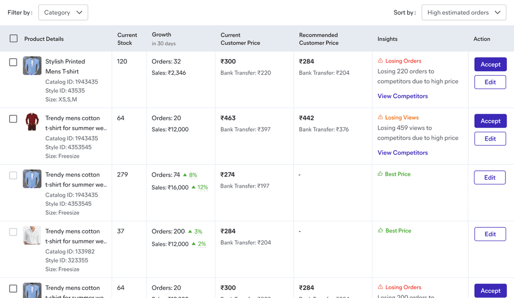
Providing inline edit functionality and Accept as single primary actionable
EXPLORATION 2
Providing all actionables within single column at product level
Improved pricing information, based on LODs, Bank Transfer is a crucial decision making point for seller so kept it at L0
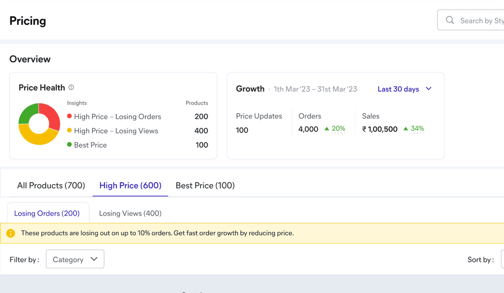
Categorized products as High Price Losing orders | High Price | Best price to bring out the criticality of actionables
USABILITY TESTING
To validates wireframes with sellers, we conducted ~12 UTs online by sharing prototype with seller. We had a list of questions, for which we provided sellers with a task to go through the flow and try to update price of any product. Below is a summary of all the responses.
Overview section
Sellers were able to comprehend High Price - Losing Order/ Views and Best Price
Other solve with Critical recommendation and needs update was not very clear to sellers neither acted as strong nudge
Accept Price flow
Sellers were happy with actionable insights and Bank Transfer information present at L0 level
We updated WDRP with its full-form as few sellers were confused with the term
Broadly sellers were aligned to accept recommendations in bulk to if prices are within margin
Pricing tabs
Overall comprehension for all 3 tabs and 2 sub-tab is very clear along with numbers.
Users are able to link between overview, tab, insights at product level based on the segregation
Edit Price flow
We received mixed comments here, majority of sellers were aligned to have all actionable in single column
Few sellers also pointed out to have it inline as in competitor websites
In terms of price breakdown, sellers were happy with the information and feasibility to make the change
All of the sellers expressed interest in editing price at product level instead of bulk actions
Insights text and tags
For most of the users Losing orders worked well to create FOMO and they mentioned to take action on such products first
Best price construct was clear that the products are now priced well on the platform
View competitor
Updated view competitor with views and order comparison details was appreciated by sellers
Using red FOMO pill along with Losing orders worked well as they were noticing it in first glance
Overall information and product attributes were relevant to take decision
