Internshala is an ed-tech platform with 16Mn+ active users, working towards the mission to equip students with relevant skills & practical exposure through online training, specializations, fresher jobs, and internships.
PROBLEM DISCOVERY
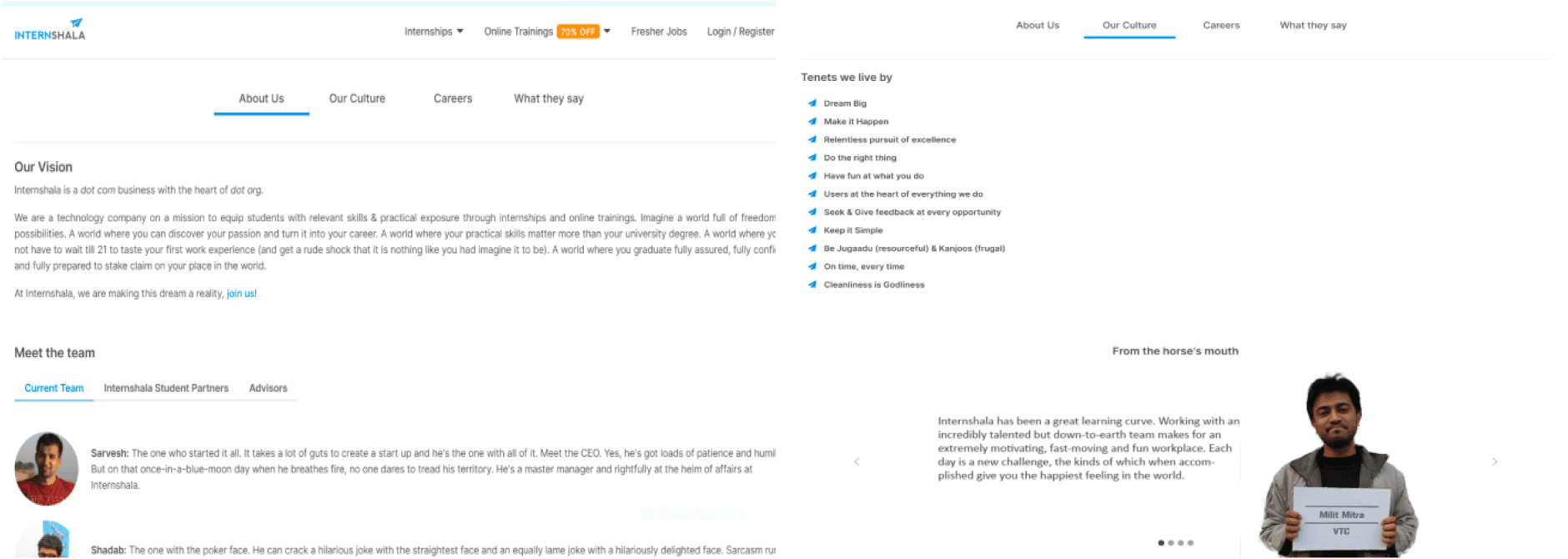
Before starting with redesigning Internshala's website (including about us, career, and culture page) as per brand identity and latest design trends. We conducted an end-to-end analysis of current design and figured out some common concerns among all the pages :
Inconsistency in Brand identity and vision of company
No clarity on how company performed so far or what kind of offerings it provides
Job openings didn’t had any segregation for clear navigation
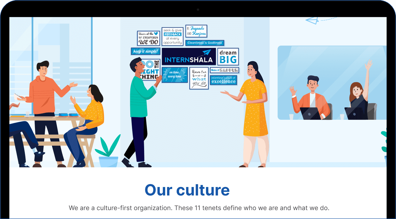
Culture and Perks was a complete miss, company’s values were complex to comprehend
RESEARCH AND ANALYSIS
In collaboration with Product, we interviewed ~15 users to understand their experience when they visit Internshala. These discussion were done internally among different teams and with few external users to collate insights on different section based on their usage(applying for job/internship at Internshala). Below is what they told us :
1
Main page has too much content to read, yet not conveying relevant info - Company’s vision
2
Culture page lacks excitement and doesn’t convey values clearly that is a must in every employee
3
Offering of internshala along with directed link is missing. People only recognize internshala with Internships
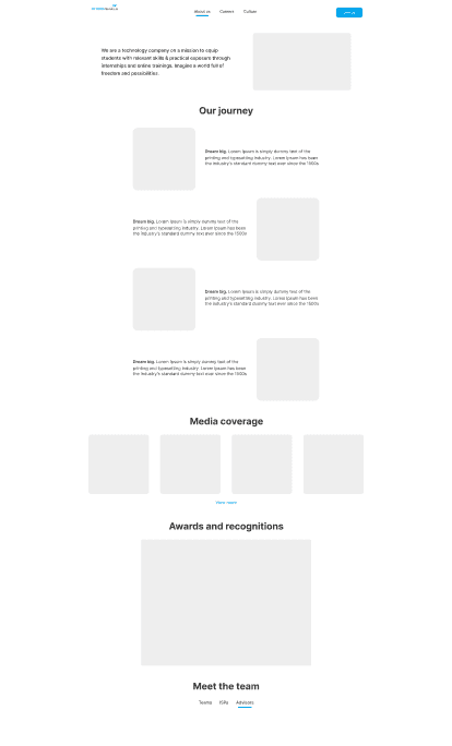
BRAINSTORMING AND WIREFRAMES
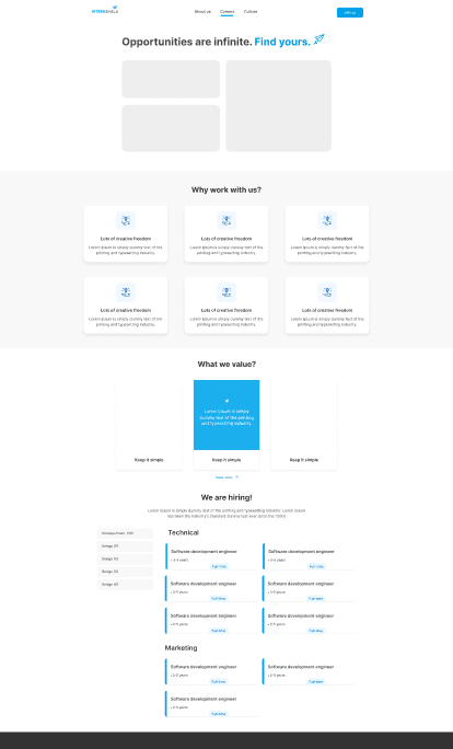
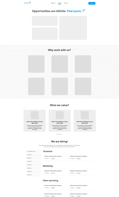
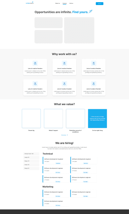
Starting with the potential user flow, how many sections to be added/ can we merge any of the sections. I proceed with pen-paper sketching to align stakeholders on broader construct and post that I conducted an internal review call to discuss Lo-fi wireframes to give a clear picture on what the page will exactly look like.
